Tap to Engage
An interactive video template with up to 10 custom pauses or loops triggered by taps, ending with a final screen.
When to use it?
This template can allow for a longer experience and can easily be used for both playable ads and interactive end cards (IECs). It’s a great template if your piece of gameplay has several key moments, that can be paused and/or looped.
Required assets
The following are the required assets in order to make this template a success:
- Background video or image
- Hint image
- End card icon
Configurable Fields
This template includes a selection of general configurable fields which are all detailed here.
Background
Store Button
Banner
End Card
App Store Controls
Sound
Advanced Settings
The specific fields which are provided with the Tap To Engage template are listed below.
Content
| Field | Type/Options | Details |
|---|---|---|
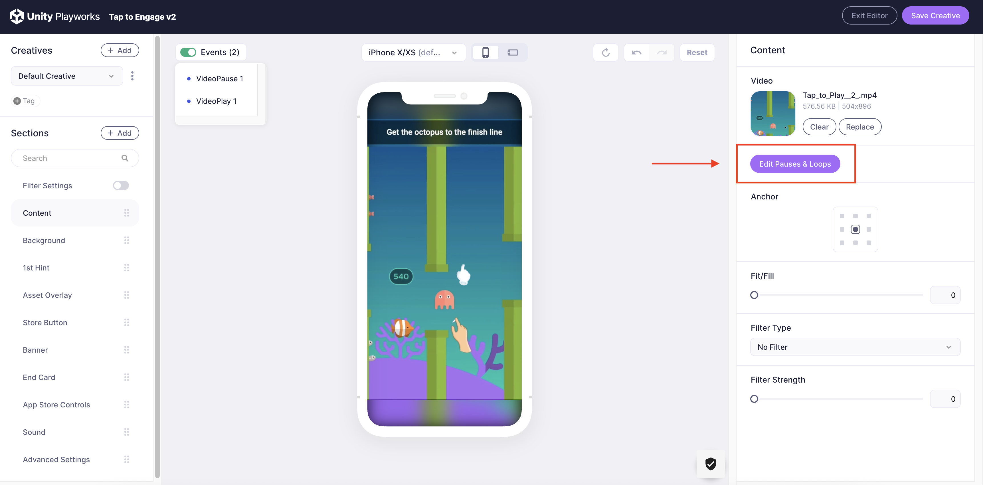
| Video | Video file (.mp4, .wav, .webm, .mkv etc.) | The video will be used throughout the playable experience. Videos are uploaded and stored in the Media Library. |
| Anchor (default & landscape) | Top Left Top Middle Top Right Middle Middle Left Middle Right Bottom Left Bottom Middle Bottom Right | As a single video needs to support multiple resolutions, the anchor control can be used to define how your video scales. For example, if your video has some important gameplay elements at the top of the screen, you may which to choose the Top Middle. |
| Video Fit/Fill (default & landscape) | Fit: The video will maintain its aspect ratio and scale to fit in 100% of the smallest dimension (width or height) depending on the resolution. Fill: The video will maintain its aspect ratio and scale to fit in 100% of both the width and height of any resolution. | The image fit/fill control is a range from 0-1. You can change your value between 0 and 1 to find the best fit for your game. We recommend using this feature in conjunction with the video anchor settings. |
| Filter Type | No filter Opacity Blur Grayscale | Select the type of filter to apply to the background video or image |
| Filter Strength | Slider (Which changes a float value) | Adjust the intensity of the selected filter on a scale from 0 (no effect) to 1 (maximum effect). |
Pauses & Loops editor
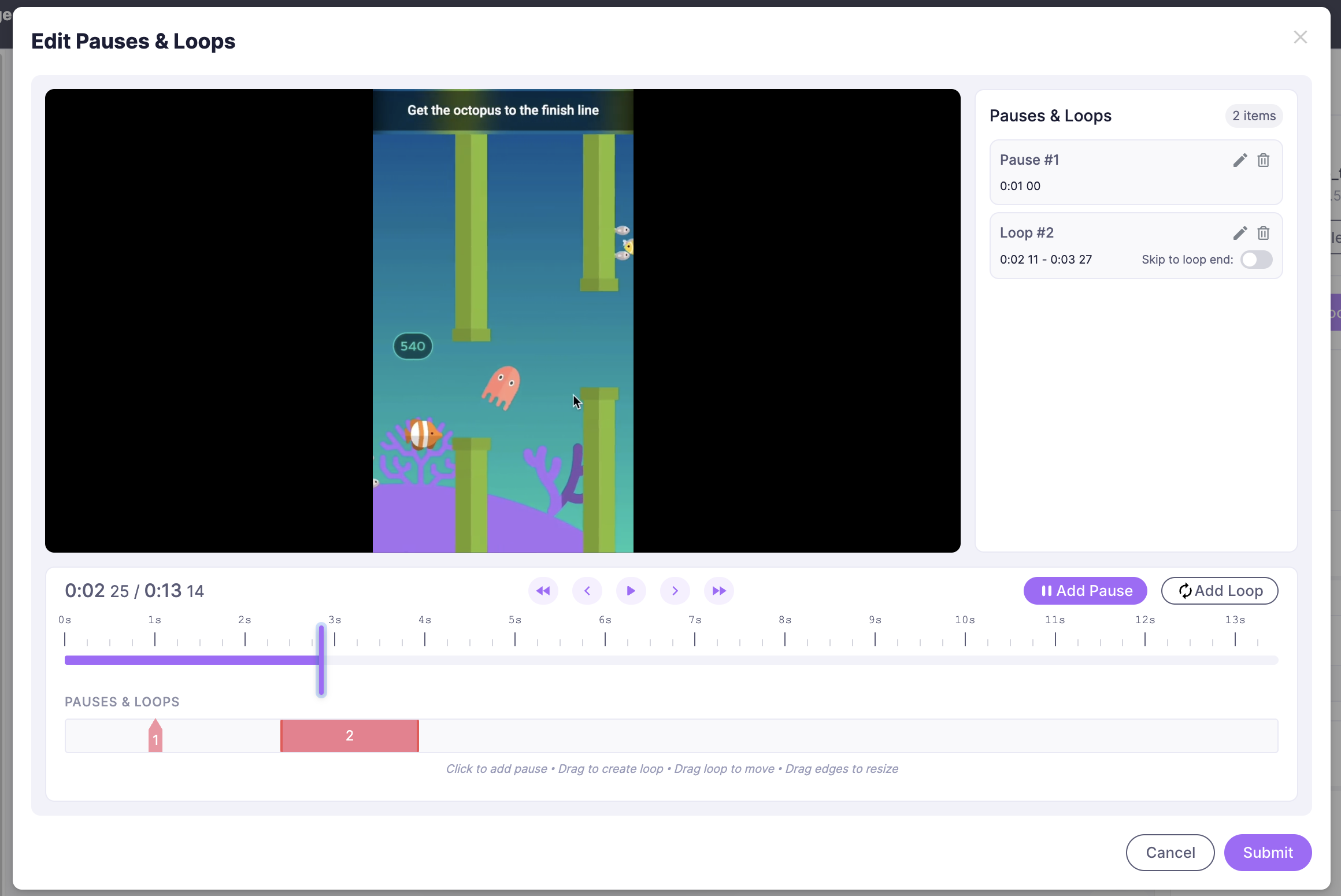
The Edit Pauses & Loops tool provides a visual interface to precisely control the timing and behavior of your interactive elements.
Accessing the Editor
To open the editor, navigate to the Content section of the template settings and click the Edit Pauses & Loops button.

Adding Elements
You can set pauses and loops using two methods within the modal:
- Control Buttons: Use the Add Pause or Add Loop buttons at the top right of the timeline.
- Timeline Interaction:
- Pause: Click anywhere on the bottom timeline track to add a pause marker.
- Loop: Click and hold on the timeline, then drag to define the loop duration.

Navigation and Precision
Use the playback controls to navigate your video frame-by-frame:
Single Arrow (< / >): Moves the playhead by a single frame.
Double Arrow (<< / >>): Jumps between existing Pauses and Loops on the timeline.
Configuration & Hints
All added elements are listed in the right-hand sidebar.
Edit Settings: Clicking the Pencil icon on a pause or loop entry will automatically navigate you to the corresponding Hint section in the main editor to customize the UI.
Skip to loop end: When enabled for a loop, the video will jump to the end of the loop immediately after a user tap, rather than finishing the current cycle.
For stable performance, do not place a Pause marker inside the range of a Loop.
Testing
Once you have finished editing, click Submit. You can verify the behavior by returning to the Creative Editor preview.
Hint
| Field | Type/Options | Details |
|---|---|---|
| Text (default & landscape) | String (Letters, Numbers and Symbols) | The text to use in the hint. NOTE: The text for the hint is not positioned relative to the hint image. |
| Text color (default & landscape) | Click on the color bar to open the color context menu and begin choosing a color. | The color of the hint text. |
| Text size (default & landscape) | A float value (Number value that allows decimals, negative values will default the value used back to 1) | The size of the text, the larger the value entered the larger the text will be. The scale is done in rem, so 1 will roughly equal 5% of the viewport's size. |
| Text offset (default & landscape) | Slider (Which changes a float value) | Moves the hint image along the x or y axis (horizontally or vertically). |
| Image | Image file (.png, .jpg, .jpeg, etc.) | The image to use for each hint. If you are using a custom gesture and not an asset provided in the asset library, then we recommend the following: APNG format Ensure the focus point of the gesture (i.e where to tap) is at the centre of the image (use padding if necessary) |
| Size (default & landscape) | Float value (Number value that allows decimals, negative values will default the value used back to 50) | This determines the size of the image, the higher the value the larger the image will be. The scale is done in rem, so 1 will roughly equal 5% of the viewport's size. |
| Image Offset (default and landscape) | Slider (Which changes a float value) | Moves the hint image along the x or y axis (horizontally or vertically). |
| Flip | No Flip Flip horizontally Flip vertically Flip horizontally & vertically | Select which way you wish to flip your hint image. |
| Tap Radius | A float value (Number value that allows decimals, negative values will default the value used to 0) | This will determine how large the circular hole that is cut out of the mask is. The larger the number, the larger the hole. |
| Rotate | Slider (Which changes an float value) | Move the slider to determine what value in degrees you wish to rotate your hint image by. |
| Hole Offset (default & landscape) | Slider (Which changes a float value) | Moves the mask hole along the x and y axis (horizontally and vertically). |
| Overlay Color (default & landscape) | Click on the color bar to open the color context menu and begin choosing a color. | This controls what color is used to overlay on top of the video. A hole will then be cut out of this color overlay to help highlight your hint. By default this color will have 0 alpha, meaning it won't be visible. If you wish to make use of this mask/hole effect, select a color for the mask and adjust the alpha value to how transparent you wish the overlay to be. (A low alpha value will be highly transparent, and vice versa.) To see where to set the alpha value in the color bar menu, click on the arrow below. |
| Speed | Slider (Which changes a float value) | Move the slider to determine the speed of hint animation |
Asset Overlay
| Field | Type/Options | Details |
|---|---|---|
| Image | Image file (.png, .jpg, .jpeg, .gif, etc.) | The animated or static image that will overlay your video during the playable experience. |
| Hide Assets after step | Don't hide: The asset will remain visible. Hide after "X" steps: The asset will not appear again after X pauses. | Choose when the asset should be hidden. You can hide it after a certain number of steps or just don't hide it. |
| Asset visibility | Only appear with hints: The asset will only appear when hints are shown. Only appear before hints: The asset will only appear before hints are shown. Always on: The asset always be visible. | Choose when the asset should appear during the playable experience. |
| Size (default and landscape) | Float value (Number value that allows decimals, negative values will default the value used back to 15) | This determines the size of the image, the higher the value the larger the image will be. The scale is done in rem, so 1 will roughly equal 5% of the viewport's size. |
| Offset | Slider (Which changes a float value) | Moves the image along the x or y axis (horizontally or vertically). |
| Speed | Slider (Which changes a float value) | Move the slider to determine the speed of image appearance |